Accessibility
Our Commitment
The University of Utah is dedicated to creating an inclusive digital environment. We adhere to WCAG 2.1 standards to ensure our websites and web applications are accessible to all users, regardless of ability. By prioritizing accessibility, we enhance the user experience, improve search engine optimization, and fulfill our legal and ethical obligations. We strive to create websites and web applications that are not only usable but also enjoyable for everyone.

Tools for everyone
Our commitment to accessibility extends beyond compliance with standards; it's a fundamental principle that guides our approach to digital design and developmentBest Practices
Contrast Ratios:
Sufficient Contrast: Ensure that text and images have adequate contrast against the background to enhance readability, especially for users with low vision.
Please use only the accessible color combinations provided below. These combinations have been rigorously tested to ensure optimal accessibility and user experience.
UTAH RED - #BE0000
ACCESSIBLE COMBINATIONS:
WHITE - Aa - Pass
SALT FLAT GREY - Aa - Pass
BLACK - #000000
ACCESSIBLE COMBINATIONS:
WHITE - Aa - Pass
GRANITE PEAK - Aa - Pass
WASATCH SUNRISE - Aa - Pass
MOUNTAIN GREEN - Aa - Pass
GREAT SALT LAKE - Aa - Pass
SALT FLAT GREY - Aa - Pass
WHITE - #FFFFFF
ACCESSIBLE COMBINATIONS:
UTAH RED - Aa - Pass
BLACK - Aa - Pass
RED ROCKS - Aa - Pass
ZION CINDER CONE - Aa - Pass
ZION
CINDER CONE - #707271
ACCESSIBLE COMBINATIONS:
WHITE - Aa - Pass
GRANITE
PEAK - #708E99
ACCESSIBLE COMBINATIONS:
BLACK - Aa - Pass
WASATCH
SUNRISE - #FFB81D
ACCESSIBLE COMBINATIONS:
BLACK - Aa - Pass
RED ROCKS - Aa - Pass
RED
ROCKS - #890000
ACCESSIBLE COMBINATIONS:
WHITE - Aa - Pass
WASATCH SUNRISE - Aa - Pass
MOUNTAIN GREEN - Aa - Pass
GREAT SALT LAKE - Aa - Pass
SALT FLAT GREY - Aa - Pass
MOUNTAIN
GREEN - #6CC24A
ACCESSIBLE COMBINATIONS:
BLACK - Aa - Pass
RED ROCKS - Aa - Pass
GREAT
SALT LAKE - #3ABFC0
ACCESSIBLE COMBINATIONS:
BLACK - Aa - Pass
RED ROCKS - Aa - Pass
SALT FLAT
GREY - #E2E6E6
ACCESSIBLE COMBINATIONS:
UTAH RED - Aa - Pass
BLACK - Aa - Pass
RED ROCKS - Aa - Pass
Text Guidelines:
Page Titles:
- Unique and Descriptive: Each page should possess a distinct
<title>tag that accurately reflects its content. This aids both users and search engines in comprehending the page's purpose.
Heading
- Hierarchical Structure: Employ
<h>tags to organize content hierarchically, commencing with<h1>for the primary heading and progressing to<h6>for the least significant headings. - Logical Nesting: Guarantee that headings are nested appropriately, with subordinate headings positioned within their superior counterparts.
- Consistent Styling: Style headings to be visually distinguishable and adhere to the correct hierarchy, facilitating effortless scanning and comprehension

Multimedia Guidelines:
Images:
To ensure optimal accessibility for all users, including those with visual impairments, it's crucial to provide descriptive alternative text (alt text) for all images. Alt text serves as a textual representation of the image, allowing screen readers to convey its content to users who cannot see it.
Effective alt text should:
Audio & Videos:
To create a fully accessible website, it's essential to consider the needs of users with disabilities. When incorporating audio and video content, here are some crucial tips to ensure inclusivity.
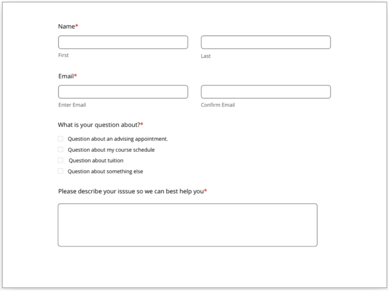
Forms:
To ensure optimal form accessibility, it's crucial to pay attention to the following key elements:
Clear and Concise Labeling:
- Visible Labels: Each form field should have a clearly visible label that accurately describes its purpose.
- Required Field Indicators: Required fields should be explicitly marked, using visual cues like asterisks (*) or bold text, in addition to textual instructions.
- Avoid Color-Only Indicators: Relying solely on color to indicate required fields or error messages can exclude users with visual impairments.
Effective Error Handling:
-
- Clear Error Messages: Provide specific and actionable error messages that guide users in correcting their input.
- Visual Cues: Highlight error fields using visual cues like red borders or error icons.
- Contextual Help: Offer additional guidance or tips to assist users in completing the form accurately.
Focus and Keyboard Operability:
To ensure optimal keyboard navigation for all users, including those who rely on assistive technologies, consider the following guidelines:
Visible Focus:
- Clear Indication: The focused element should be visually distinct, such as a highlighted border or a different color.
- Logical Order: The keyboard focus should follow a predictable sequence, typically left-to-right and top-to-bottom.
Comprehensive Keyboard Control:
- Full Functionality: All interactive elements, including links, buttons, form fields, and media controls, should be accessible via keyboard.
- Tab Order: The tab order should align with the visual layout of the page.

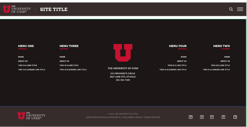
Navigation Guidelines:
A well-structured and consistent navigation system is crucial for creating accessible websites. By using clear and predictable navigation elements like main navigation, quick tabs, headers, and footers, users can easily orient themselves and locate the information they need. These landmarks provide a familiar framework, making it easier for users to navigate the site, especially those with disabilities or cognitive impairments.

Digital Document Guidelines (PDFs and More):
To ensure optimal accessibility, we recommend delivering content primarily through web pages. Websites offer inherent advantages over digital documents like PDFs, Word documents, PowerPoint presentations, Excel spreadsheets, and digital flipbooks. They are more accessible and easier to adapt to meet accessibility standards.
If Digital Documents Are Necessary:
If circumstances necessitate the use of digital documents, such as PDFs, it is imperative to adhere to Section 508 and WCAG 2.1 standards. To achieve this, consider the following:
-
- Color Palette: Employ a color palette that ensures sufficient contrast and readability.
- Remediation Services: Utilize professional remediation services to add essential tags, alternative text, and other accessibility features to your documents.
University of Utah Resources
Checklists
Automated Testing
Color Contrast Checkers
Assistive Technology
Standards & Guidelines
Get Started