Main Side Navigation

The colors we use in our University of Utah branding materials represent who we are and all the people who make this institution so great. To make sure you are accurately representing our campus, we ask that you follow our color guidelines below.

Primary University Core Colors

Prominent use of Utah Red reinforces the University brand. Utah Red is deeply ingrained in the culture of the university and has served as a key institutional identifier since the late 1800s. It is the most appropriate core color for projects originating from the university.

Designers and printers should refer to a “Utah Red Color Sample” for ink formulation and color matching on press. The color chip is to be used in achieving a visual match in any medium of reproduction including inks, paints, dyes, or other pigments when Utah Red is specified.

Copies of the “Utah Red Color Sample” are available from University Marketing and Communications, and from University Print and Mail Services.

Note: Colors shown on this page may appear to vary when viewed on different computer systems, and color printouts from this page will not be accurate.

UTAH RED

Utah Red Coated Formula R8940
Utah Red Uncoated Formula R8939
CMYK 0C/100M/79Y/20K
RGB 190-0-0
HEX #BE0000

BLACK

PANTONE BLACK
CMYK 0C/0M/0Y/100K
RGB 0-0-0
HEX #000000

WHITE

PANTONE WHITE
CMYK 0C/0M/0Y/0K
RGB 255-255-255
HEX #FFFFFF

Accent Colors

Accent colors, when used, should be complementary and subordinate to Utah Red and black. It is strongly recommended that designers avoid using blue or purple as stand-alone colors to avoid creating confusion with other regional universities’ school colors.

Accent colors may be used minimally where appropriate. They are not to usurp the core colors, but are used to:

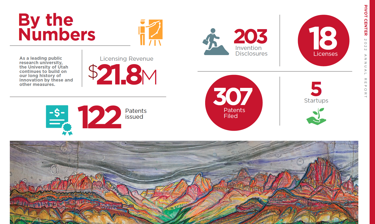
Enhance charts, graphs, and info graphics Add variety to unique needs (t-shirts and seasonal events). Augment publications and consumer content.

Accent Colors should not be used in conjunction with the university logos and should never be used to represent the brand.

The colors shown throughout this branding guide have not been evaluated by Pantone, Inc., for accuracy and may not match the PANTONE® Color Standards. Consult current PANTONE® Publications for accurate color. PANTONE® is the property of Pantone, Inc.

GRANITE
PEAK

SPOT PMS 7544 CP
CMYK 52C/26M/26Y/16K
RGB 117-142-153
HEX #708E99

WASATCH
SUNRISE

SPOT PMS 1235 CP
CMYK 0C/32M/94Y/0K
RGB 255-184-29
HEX #FFB81D

RED
ROCKS

SPOT PMS 202 CP
CMYK 0C/100M/89Y/50K
RGB 130-0-0
HEX #890000

MOUNTAIN
GREEN

SPOT PMS 360 CP
CMYK 63/0/84/0
RGB 108-194-74
HEX #6CC24A

GREAT
SALT LAKE

SPOT PMS 325 CP
CMYK 67C/0M/29Y/0K
RGB 58-191-192
HEX #3ABFC0

SALT FLAT
GREY

SPOT PMS 7541 CP
CMYK 10C/5M/7Y/0K
RGB 226-230-230
HEX #E2E6E6

ZION
CINDER CONE

SPOT PMS 424 CP
CMYK 57C/47M/48Y/14K
RGB 112-114-113
HEX #707271

Accent Color Examples